Portfolio is available as a PDF upon request.
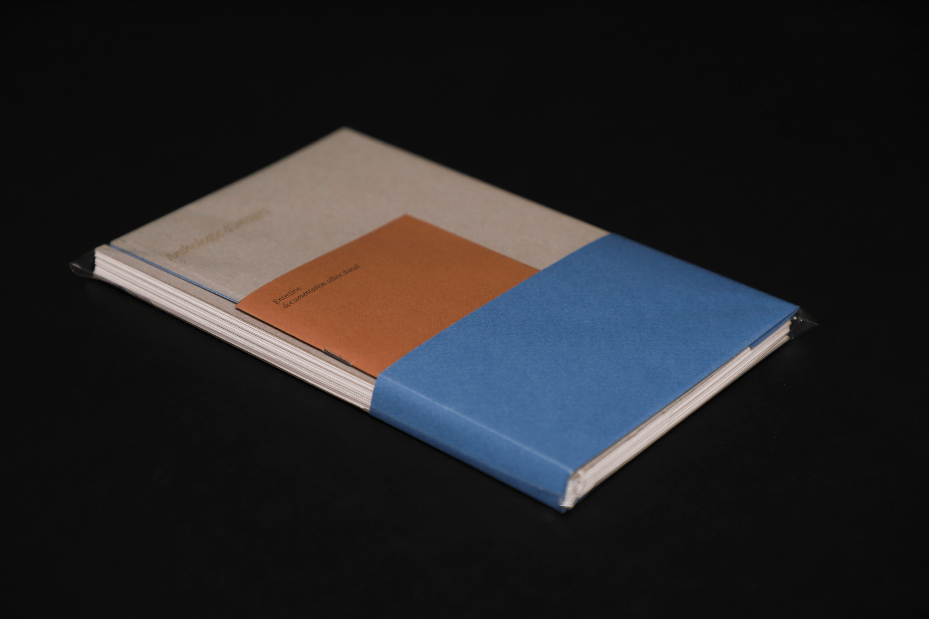
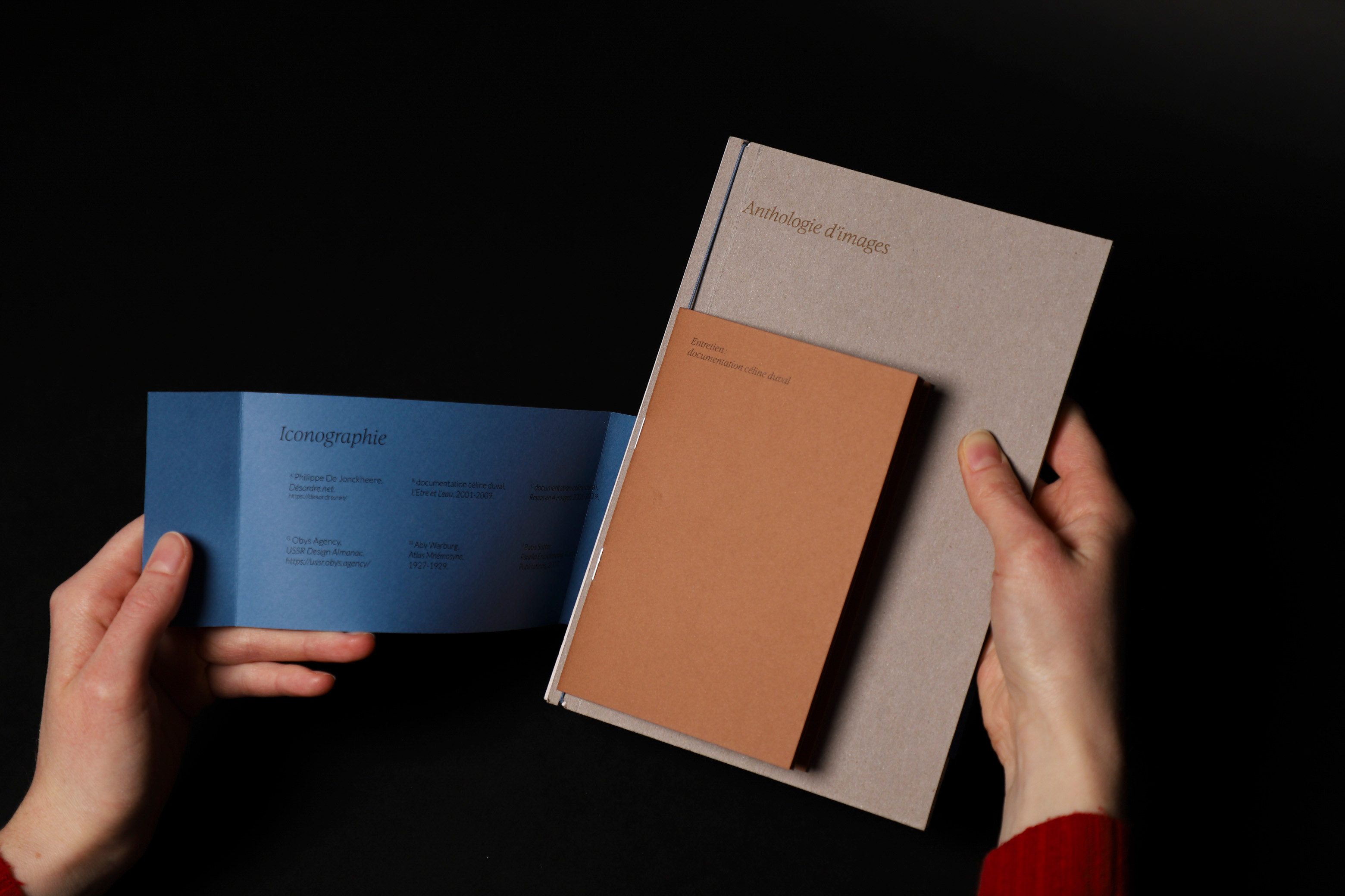
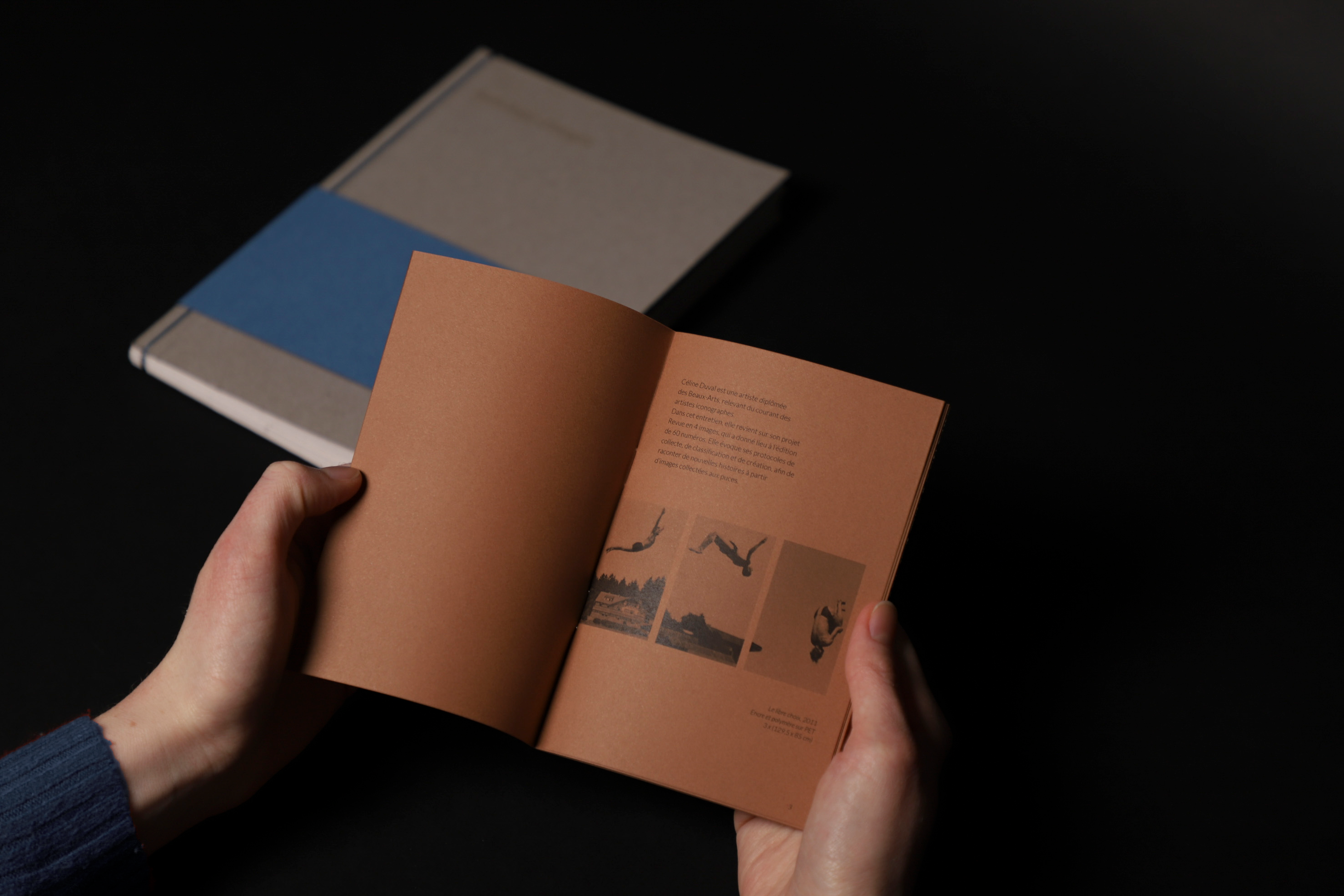
Anthology of images
2025. Academic research. Edition.
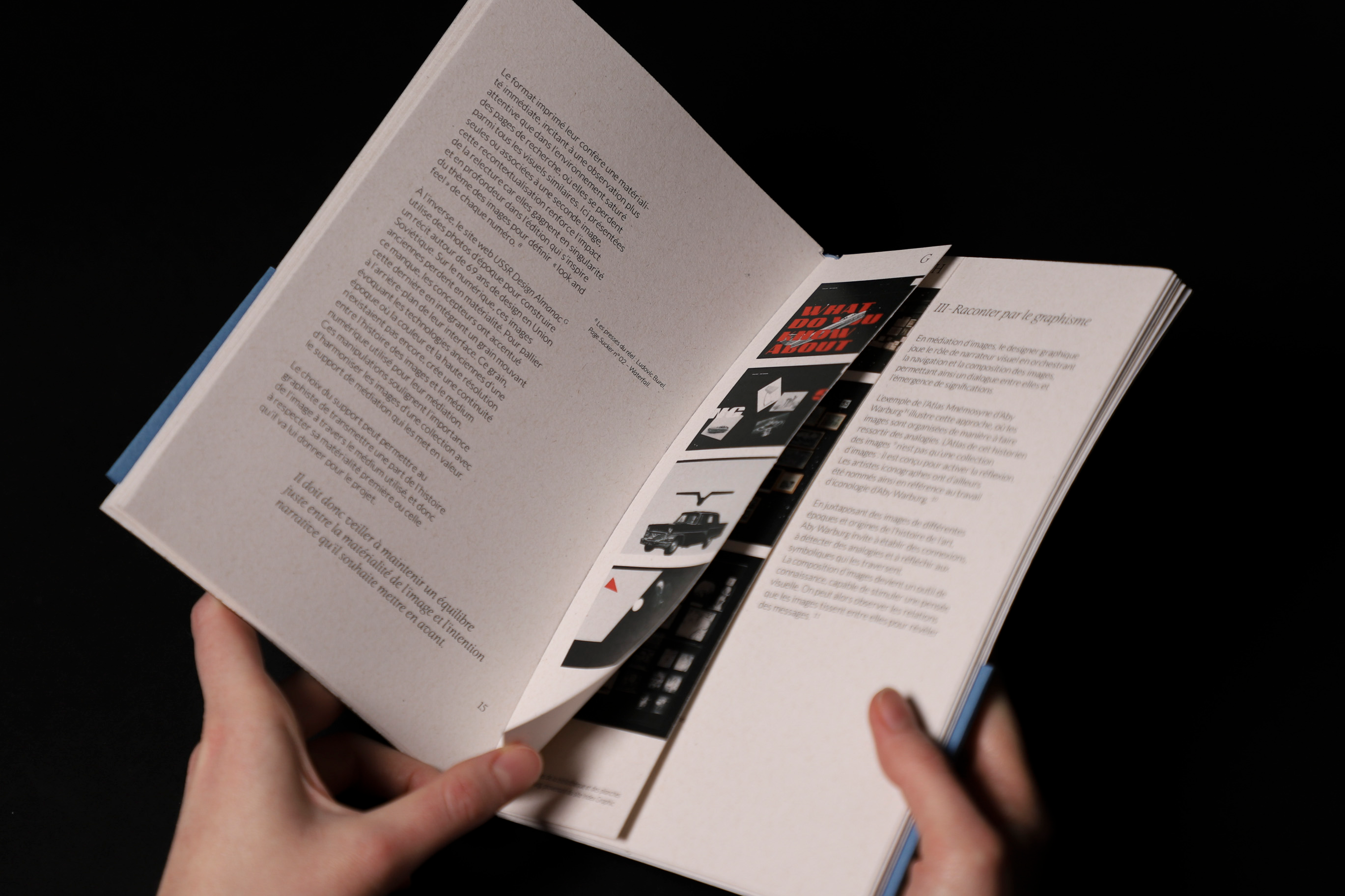
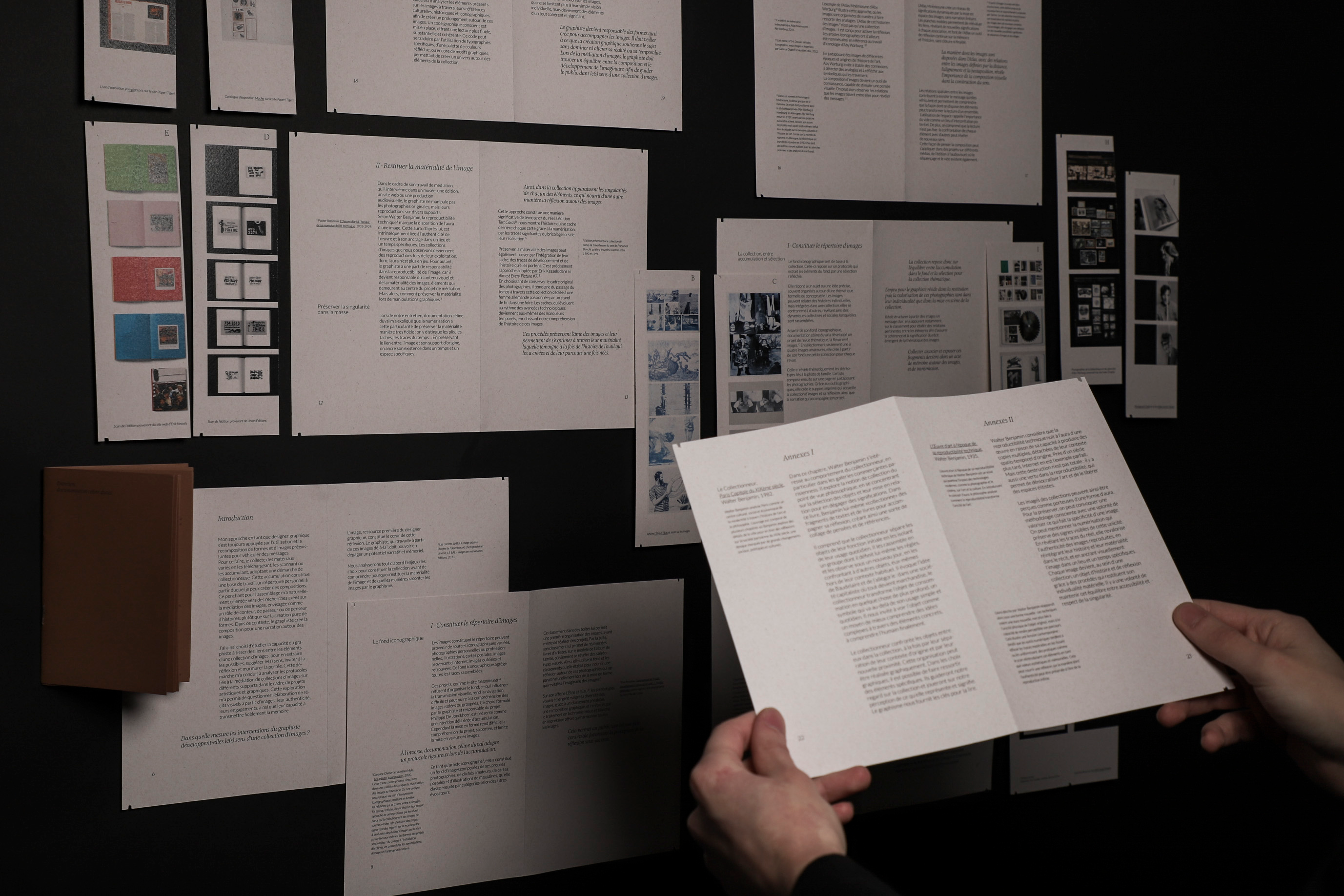
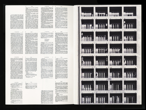
This thesis examines the role of graphic designers in mediating image collections. In this context, graphic designers compose visuals from pre-existing elements. From collecting images to designing the medium and narrative, they must take into account the duality of collections: between the individuality of images and the construction of a narrative. Their work thus oscillates between preservation and creation. To what extent do graphic designers' interventions develop the meaning(s) of an image collection?
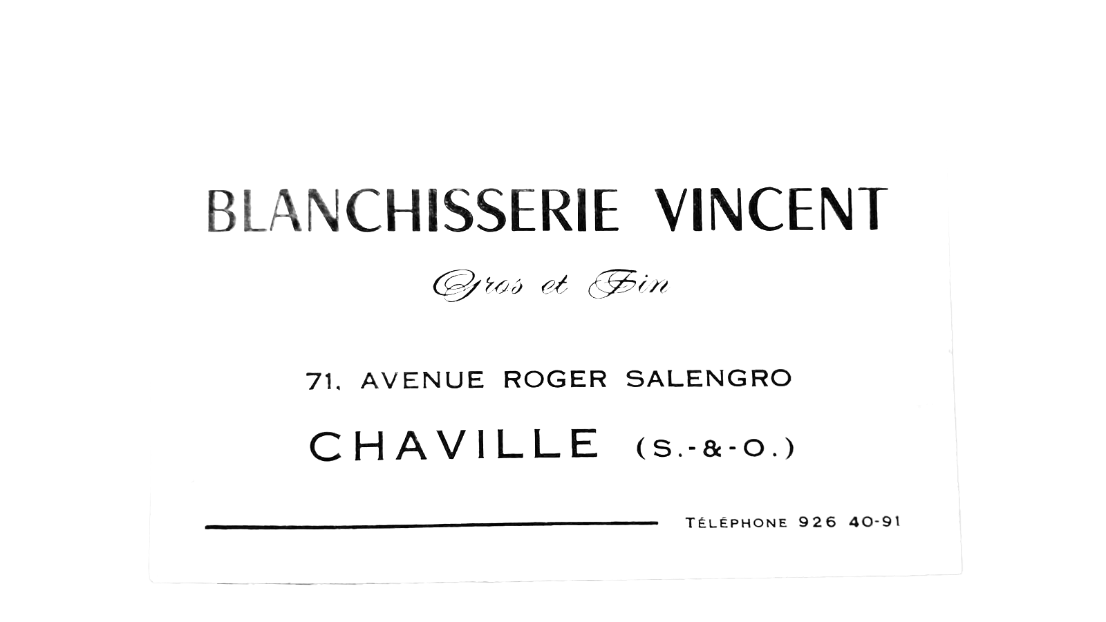
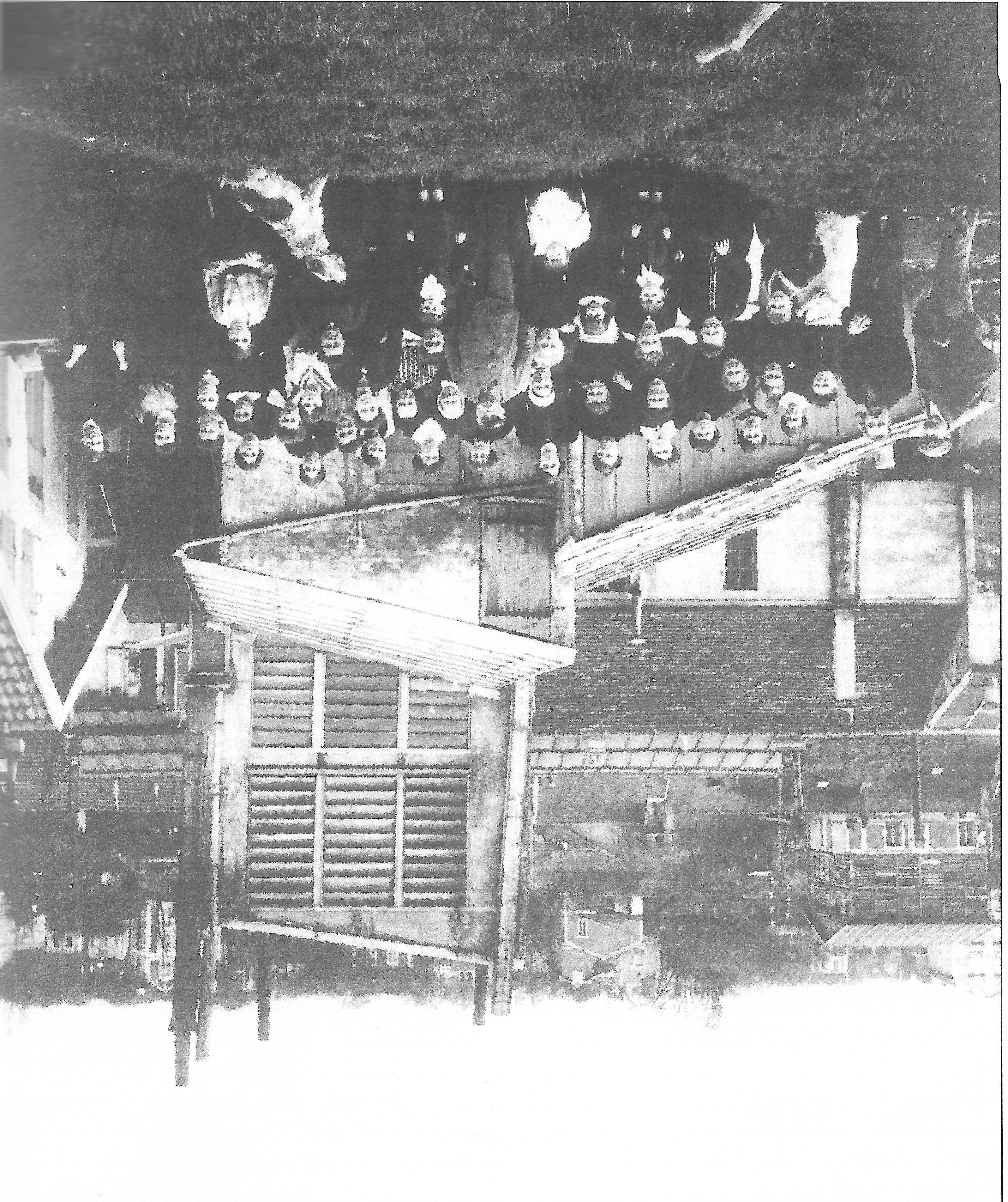
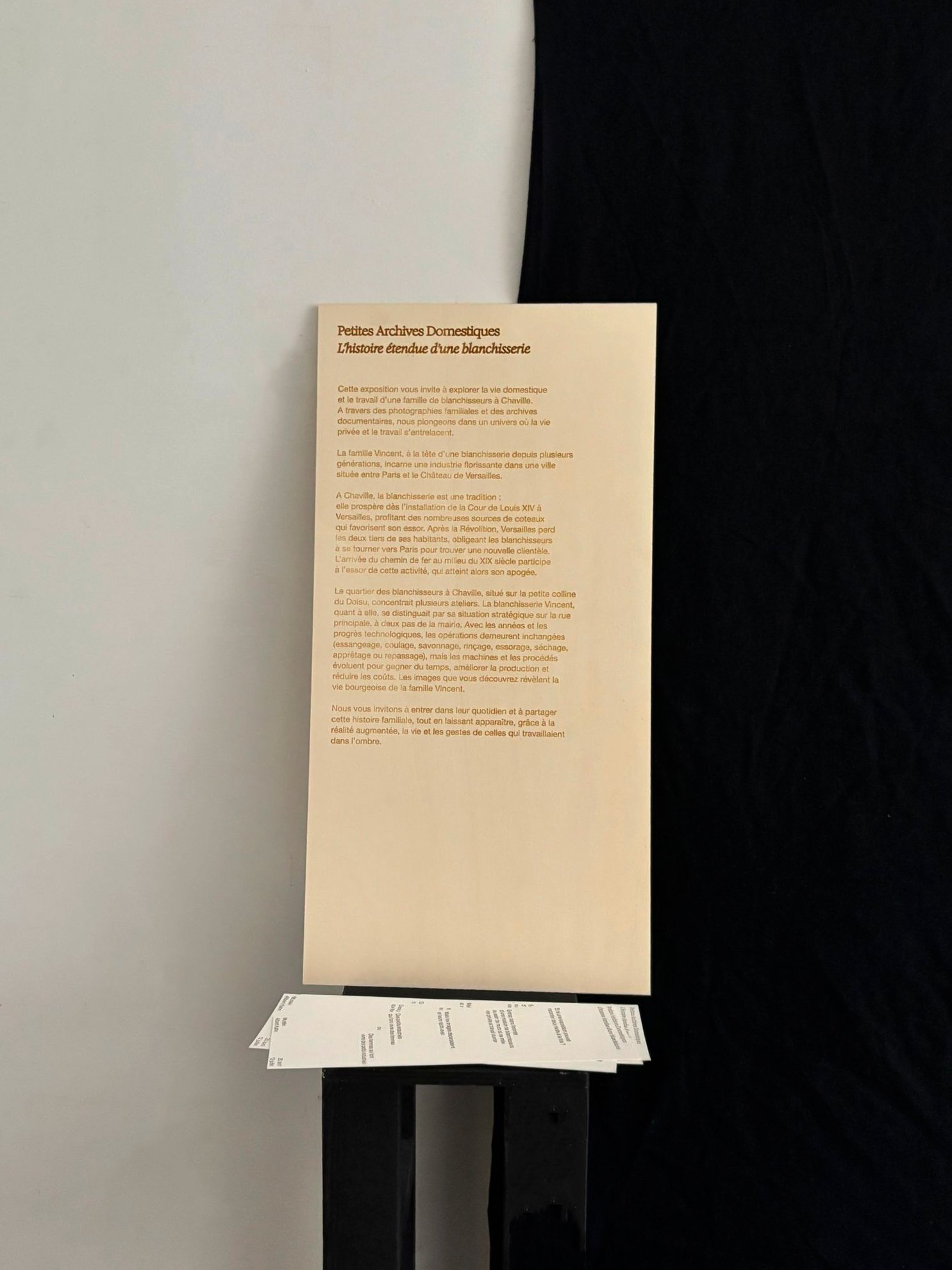
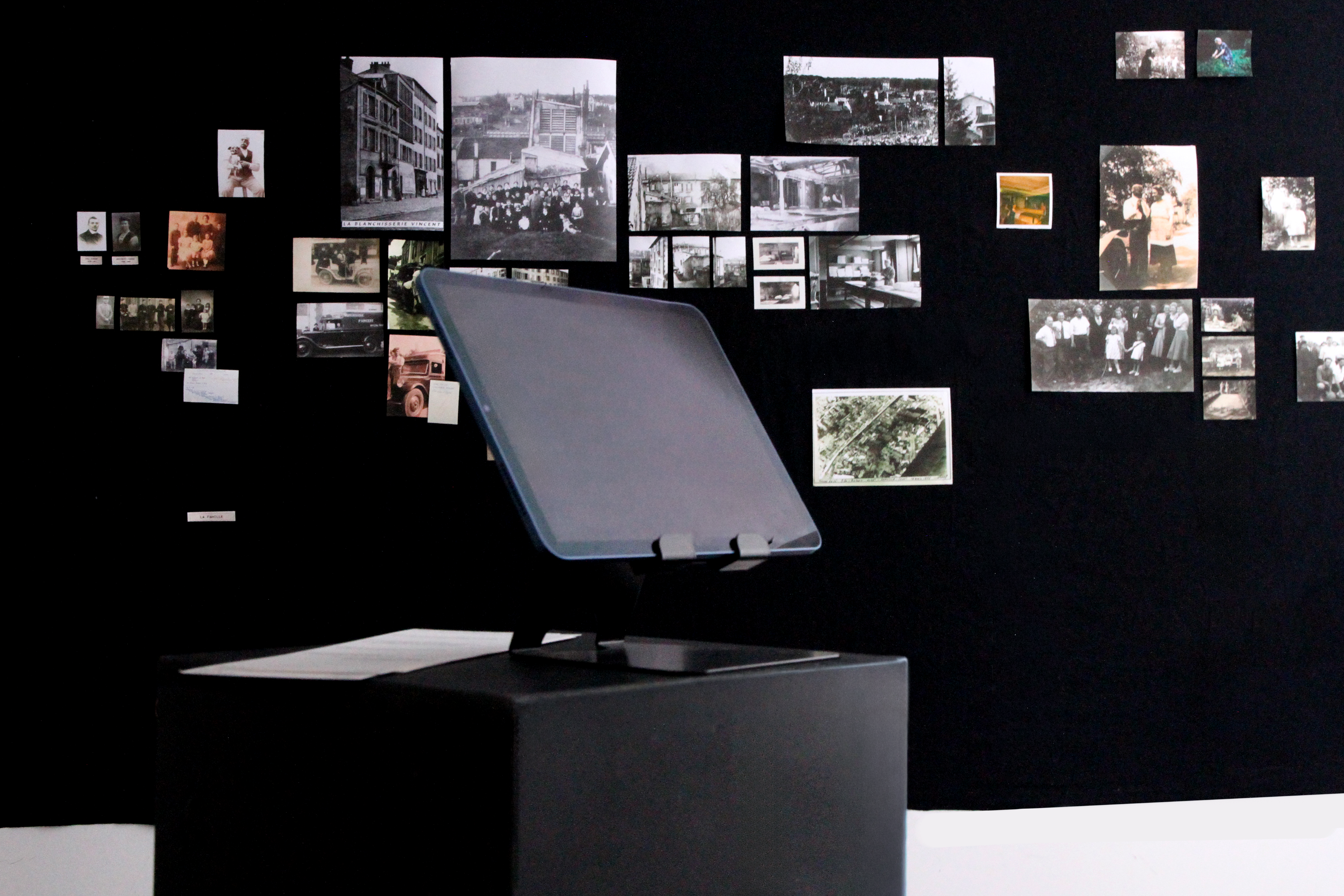
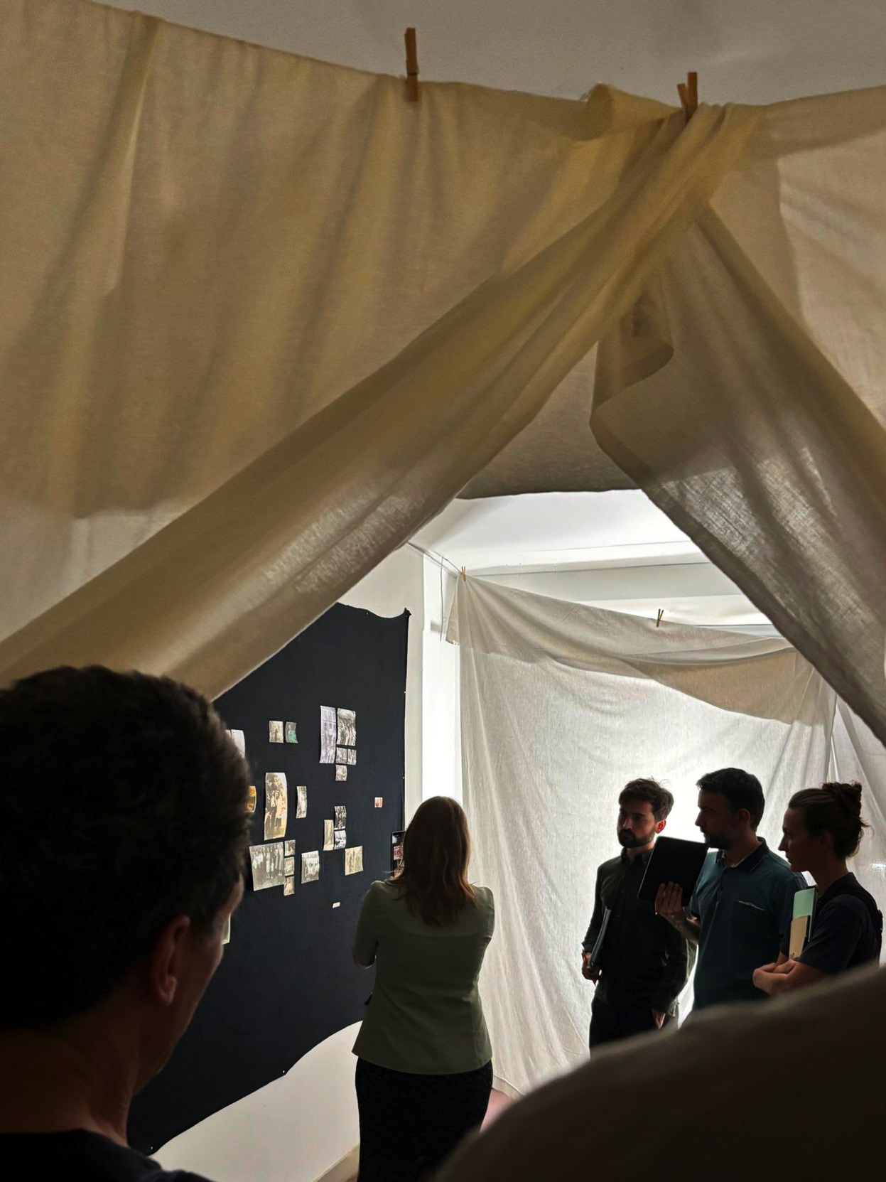
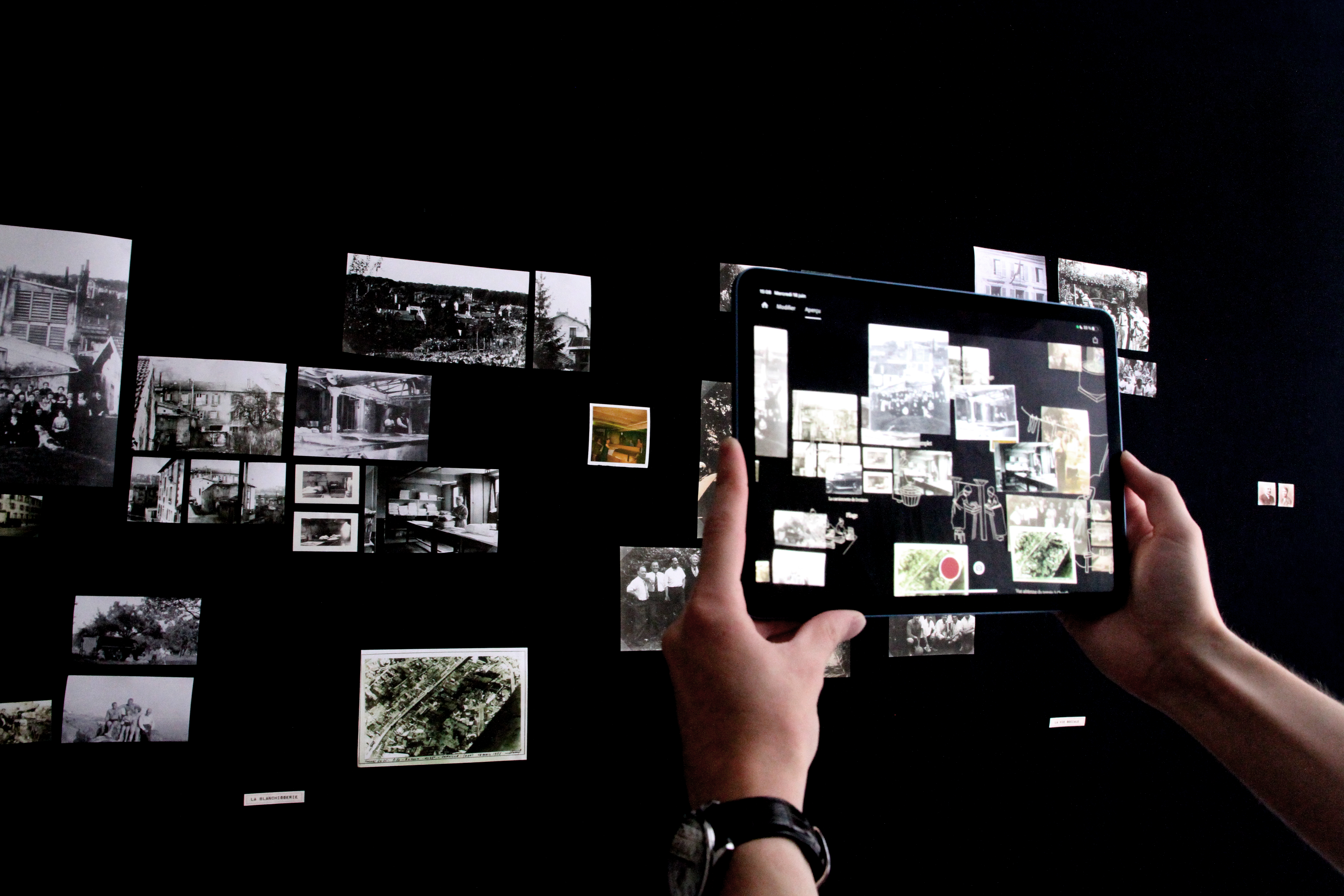
A Laundry’s Unfolded History
2025. Diploma project.
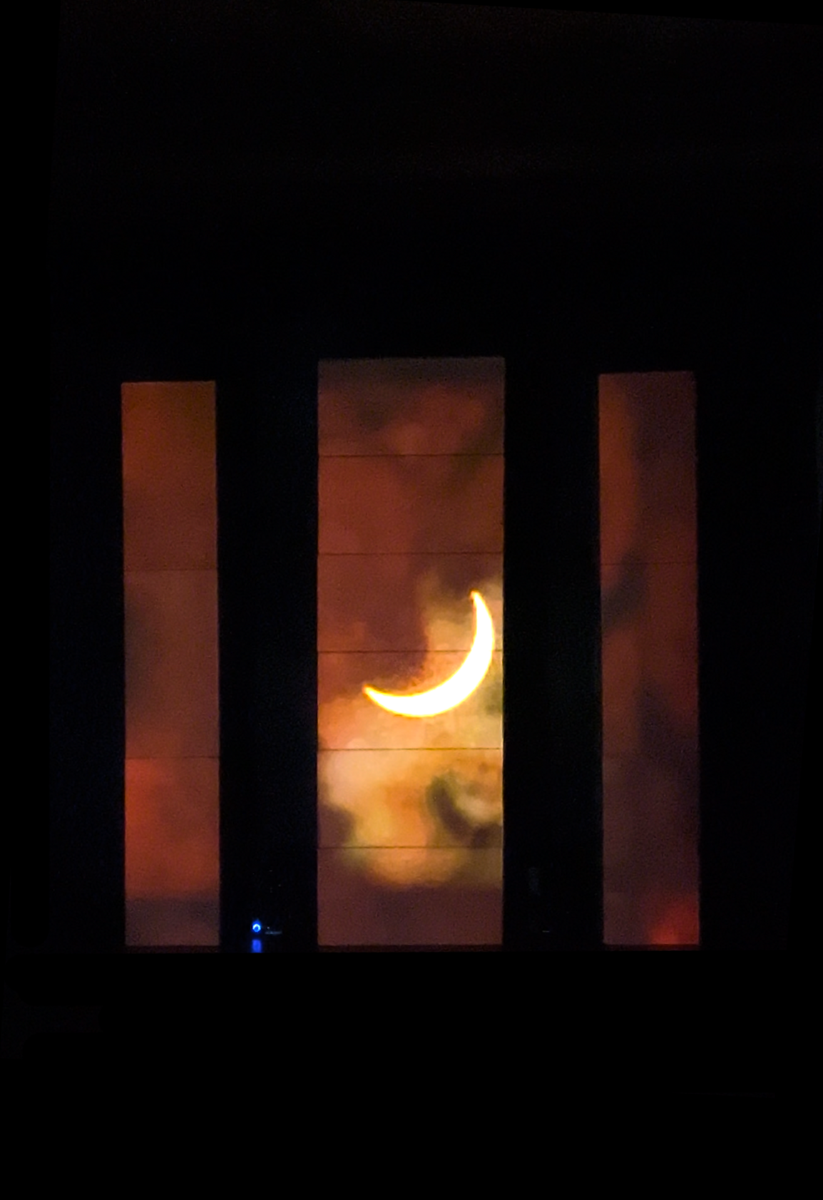
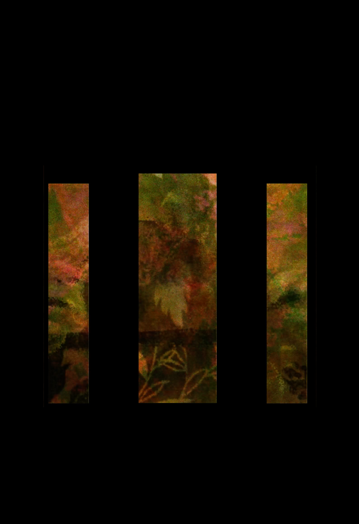
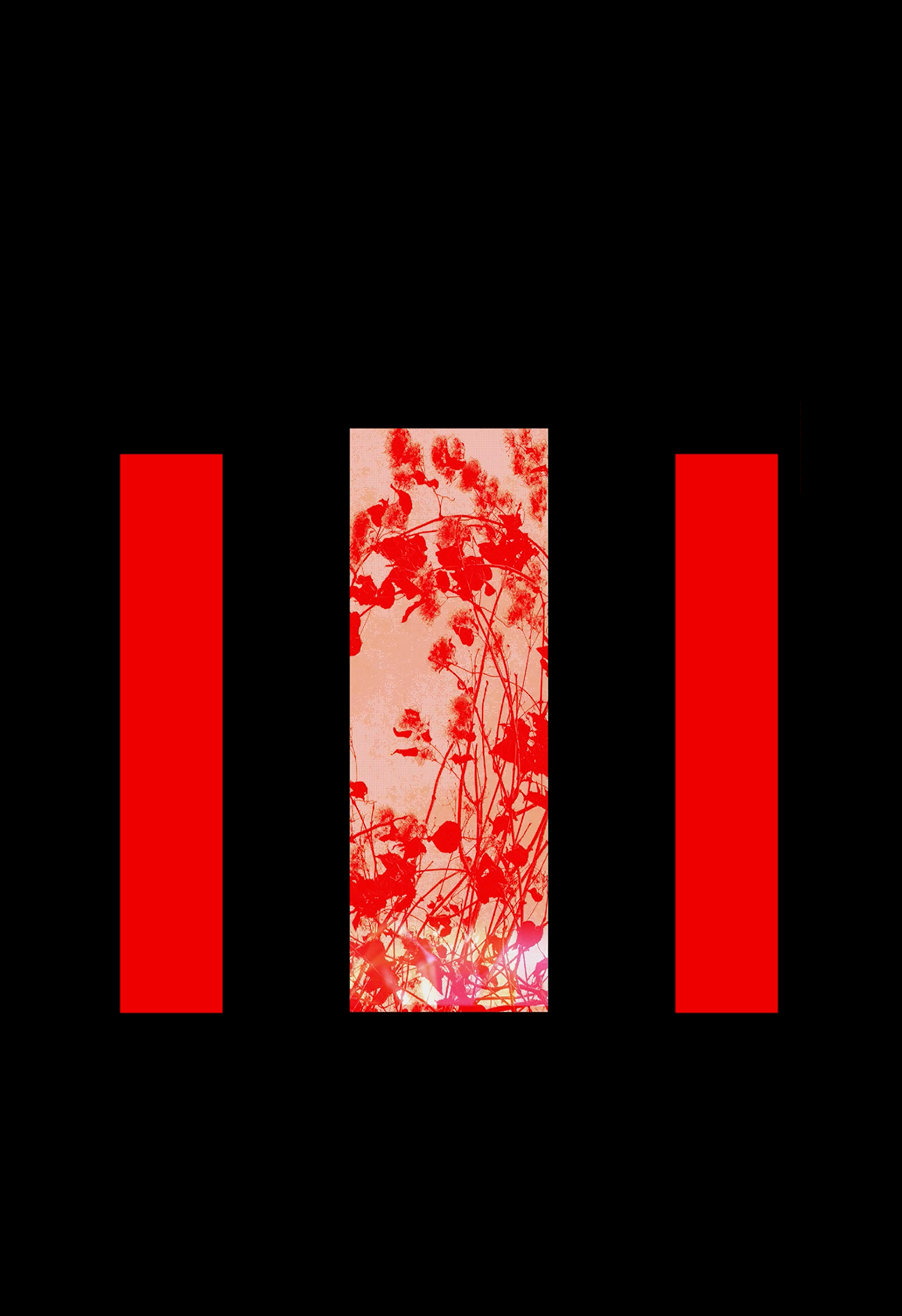
This exhibition, rooted in family archives and informed by academic research on memory, explores
the domestic life and work of a family of launderers in Chaville.
Through family photographs and documentary records, it reveals a world where private life and
labor are closely intertwined.
The Vincent family, at the head of a laundry business for several generations, embodies a
once-flourishing industry in a town located between Paris and the Château de Versailles.
The exhibition opens a window onto their daily lives and this shared family history, while
augmented reality brings to light the gestures and presence of the women who worked in the shadows, which
were never captured in the images of the family collection.
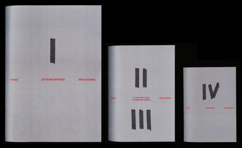
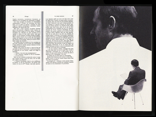
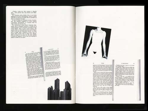
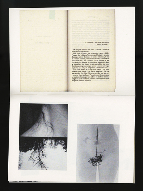
Ravage
2024. Edition.
This reissue of Ravage by René Barjavel aims to present the story in a new way to serve an original concept. Inspired by travel journals and archives from a bygone era, it offers a contemporary perspective by highlighting the utopias and realities of the 1940s that the book denounces. Designed in the spirit of Arte Povera, I used scans of my own edition to create a modest layout, emphasizing the materiality of the original book. The grayscale palette of the three editions is occasionally enhanced with orange-toned photographs, evoking the destructive fire described in the story.
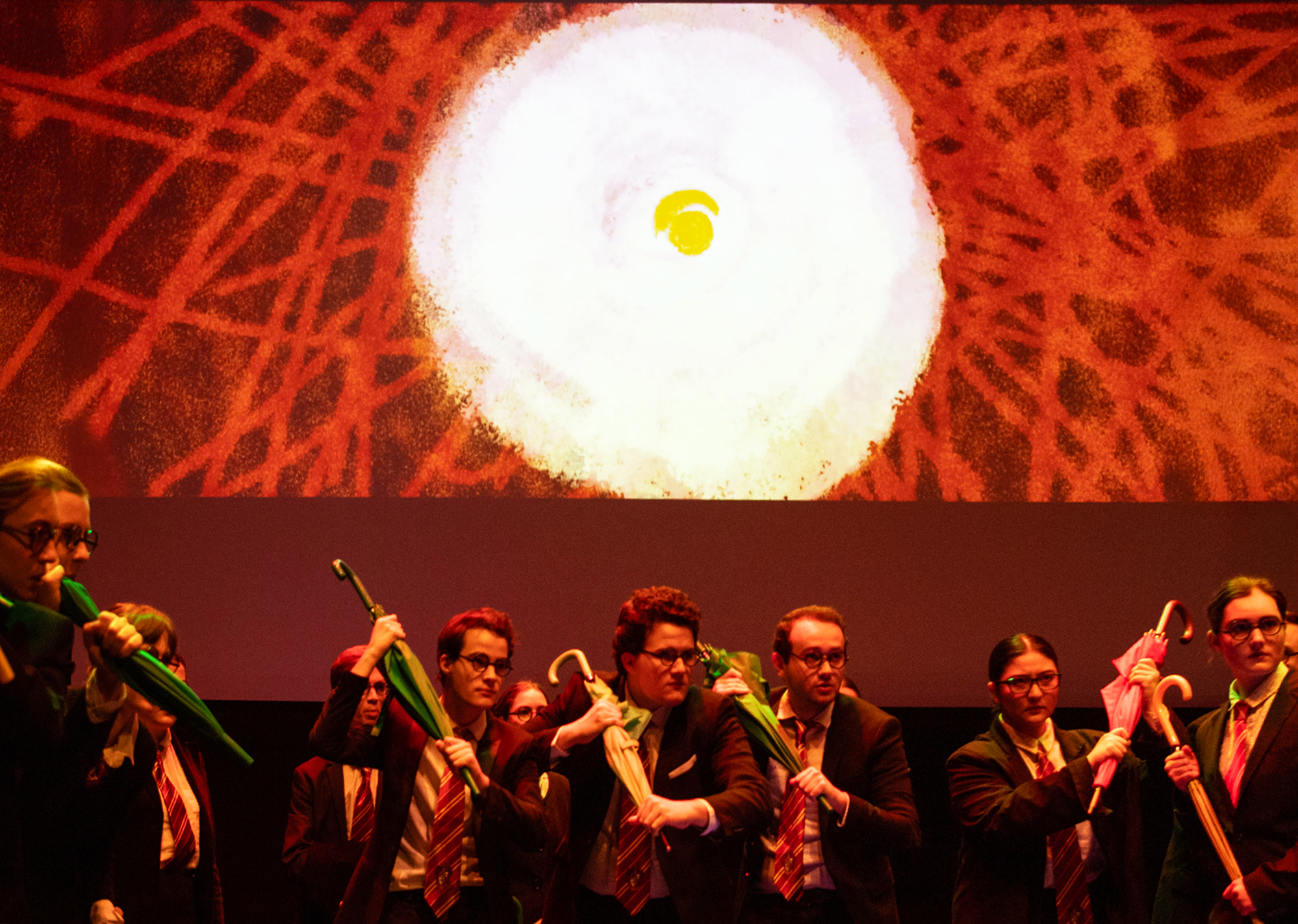
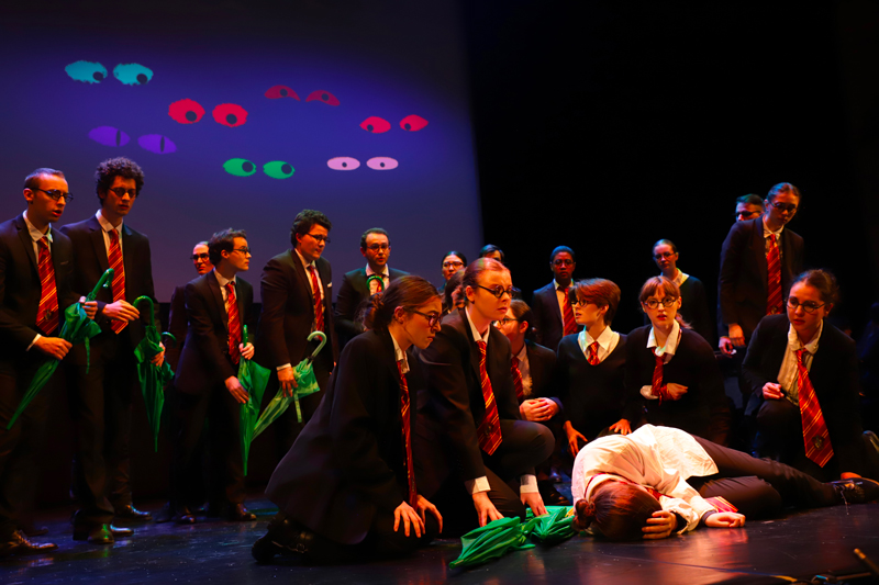
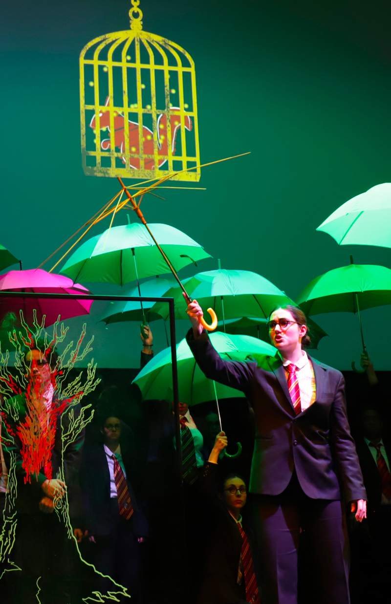
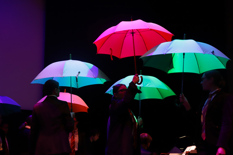
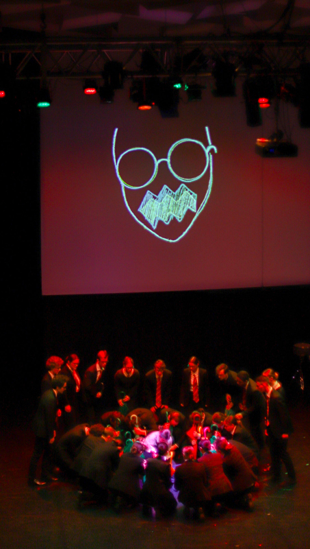
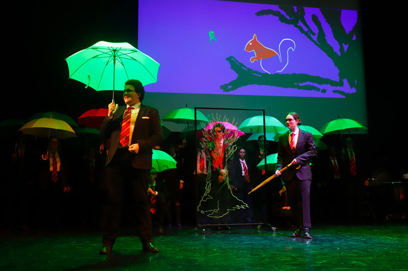
L'Enfant & les Sortilèges
2024. Opera Set.
The opera L’Enfant et les Sortilèges by Colette and Ravel, directed by Vincent Vittoz at the Conservatoire of Boulogne-Billancourt, offers a fresh take on the story. Set in a contemporary school environment, the child endures mistreatment from both teachers and classmates. To enrich the stage performance, we created animations and projected visuals inspired by Colette’s universe, giving form to the Child’s inner thoughts. These digital projections, synchronized with the orchestra and filling the stage as animated sets, were performed live by our team. I created three sequences, each with a distinct visual world, to illustrate the ending of the show.
Dark Room
2025. Video Mapping.
A volumetric projection setup created as a duo, offering an immersive experience in a dark room. The narration was guided by the music, with visuals that reacted to sound using the software Resolume. The graphic approach aimed to immerse the viewer in a poetic universe, inspired by the passage of time in nature, blending organic and digital elements.
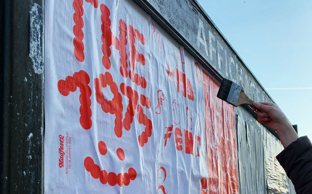
Madfest
2024. Typographic design posters.
This fictional music festival served as a playground for typographic experimentation through the creation and public display of a series of posters in the streets of Boulogne-Billancourt. Robin Abreux, graphic designer and typographer, led this two-day workshop dedicated to exploring lettering on poster formats. By working with various mediums such as scratch cards, clay, paint, and markers, we experimented with different approaches, combining spontaneity with stencil-based design. The posters were then displayed in public spaces.


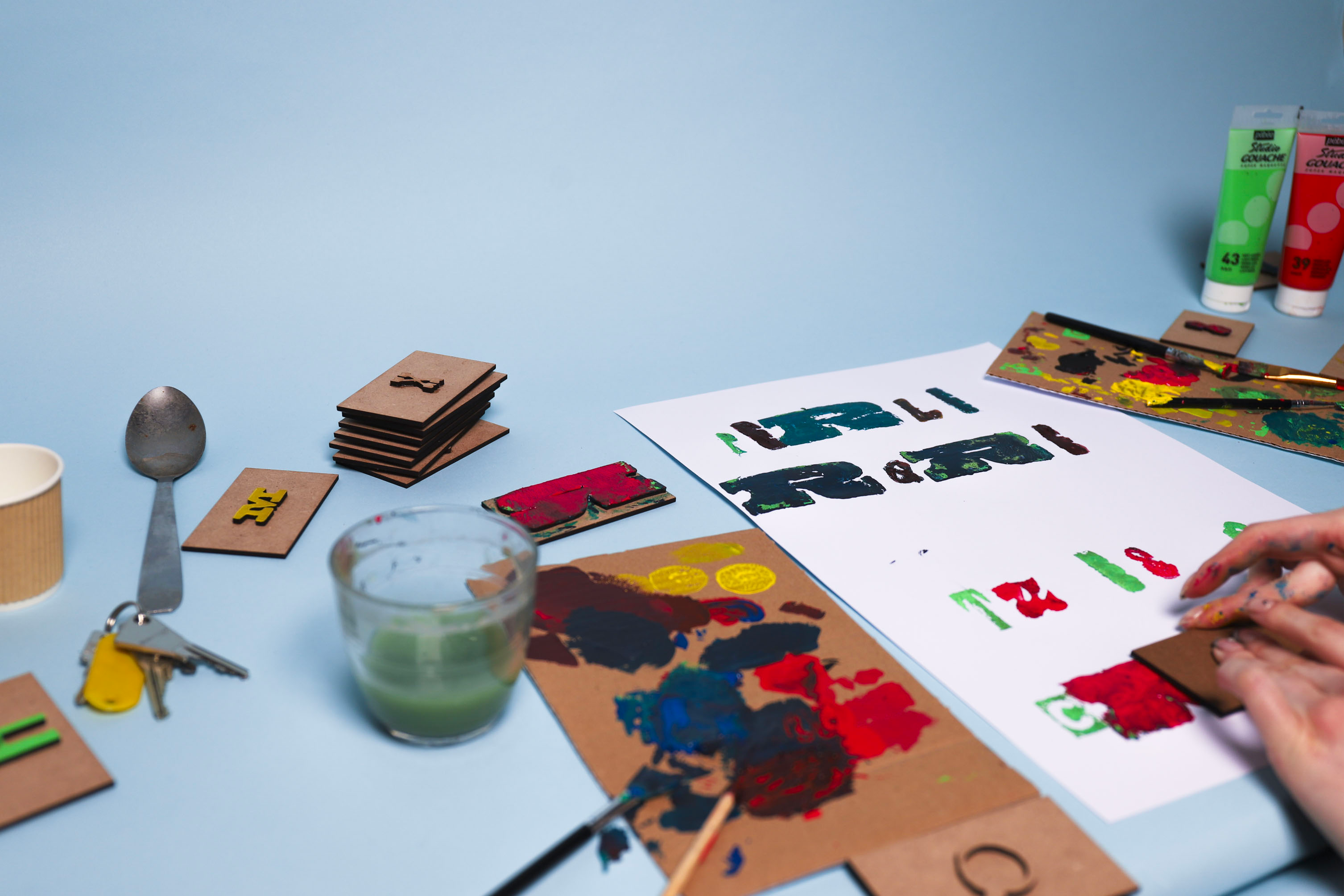
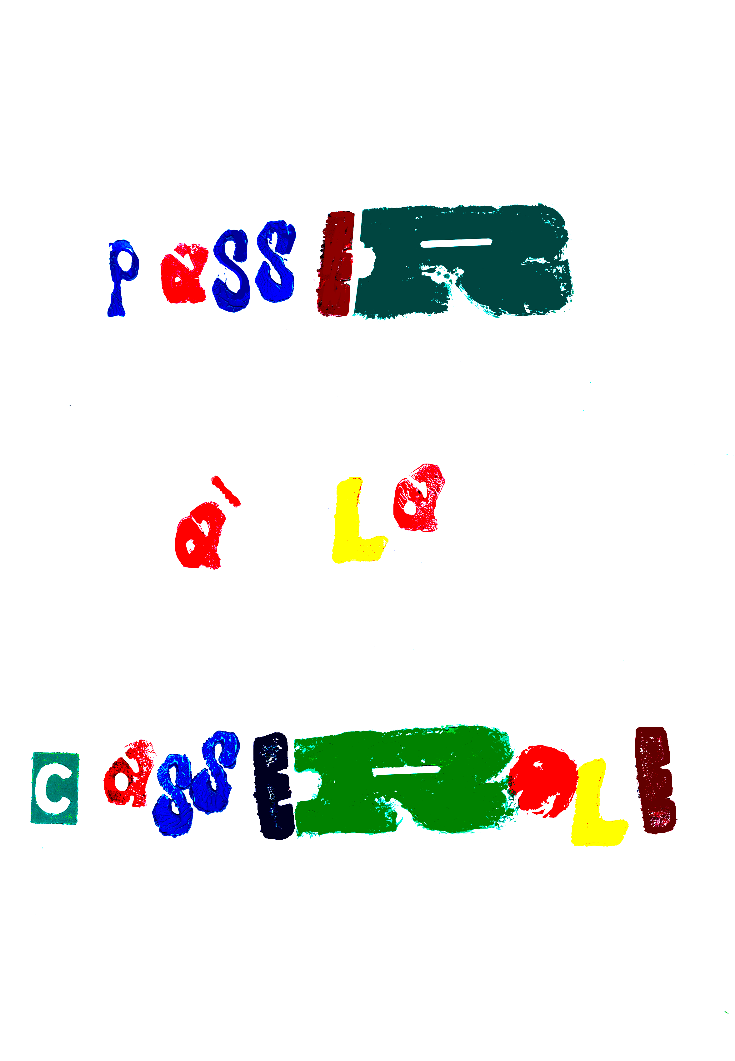
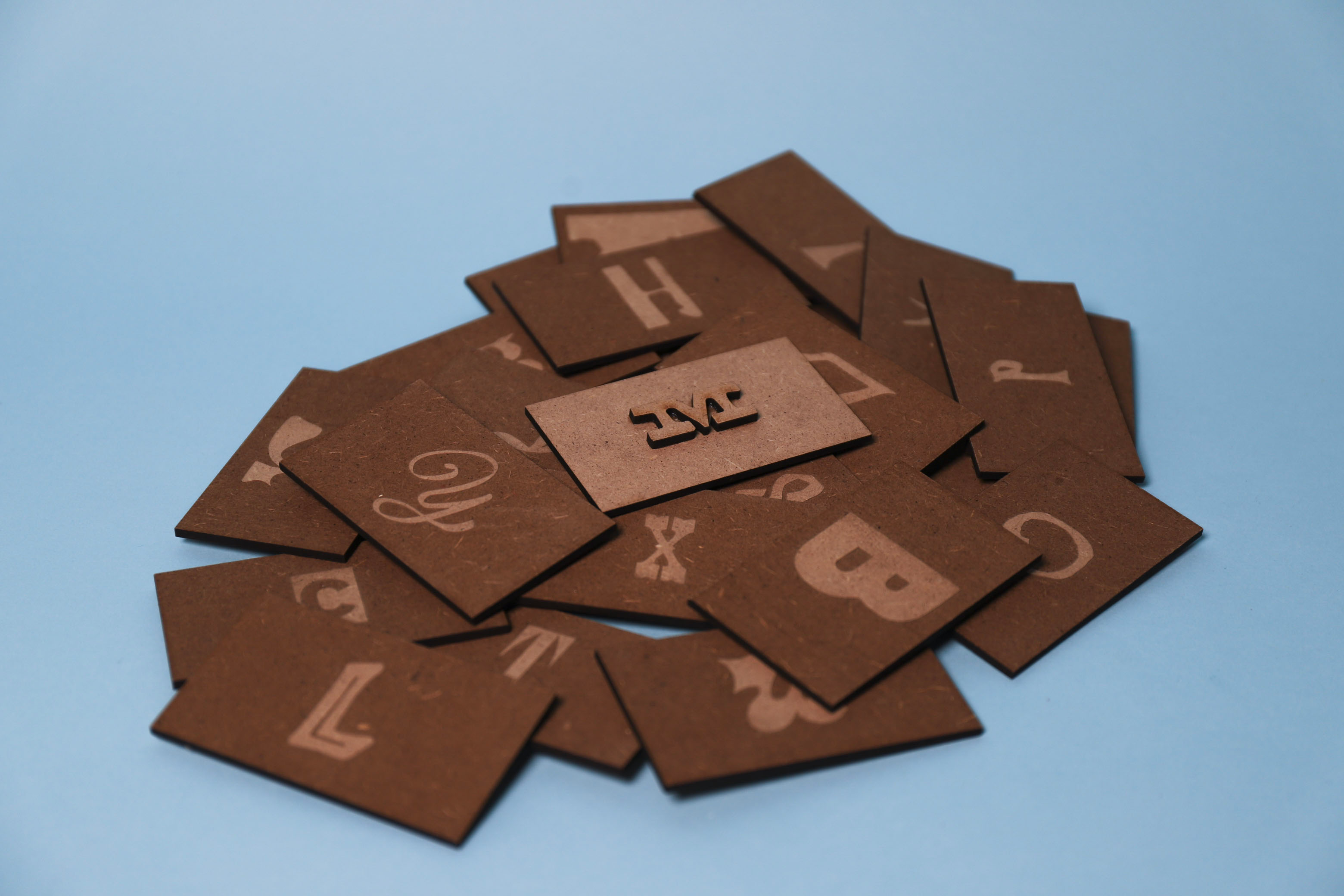
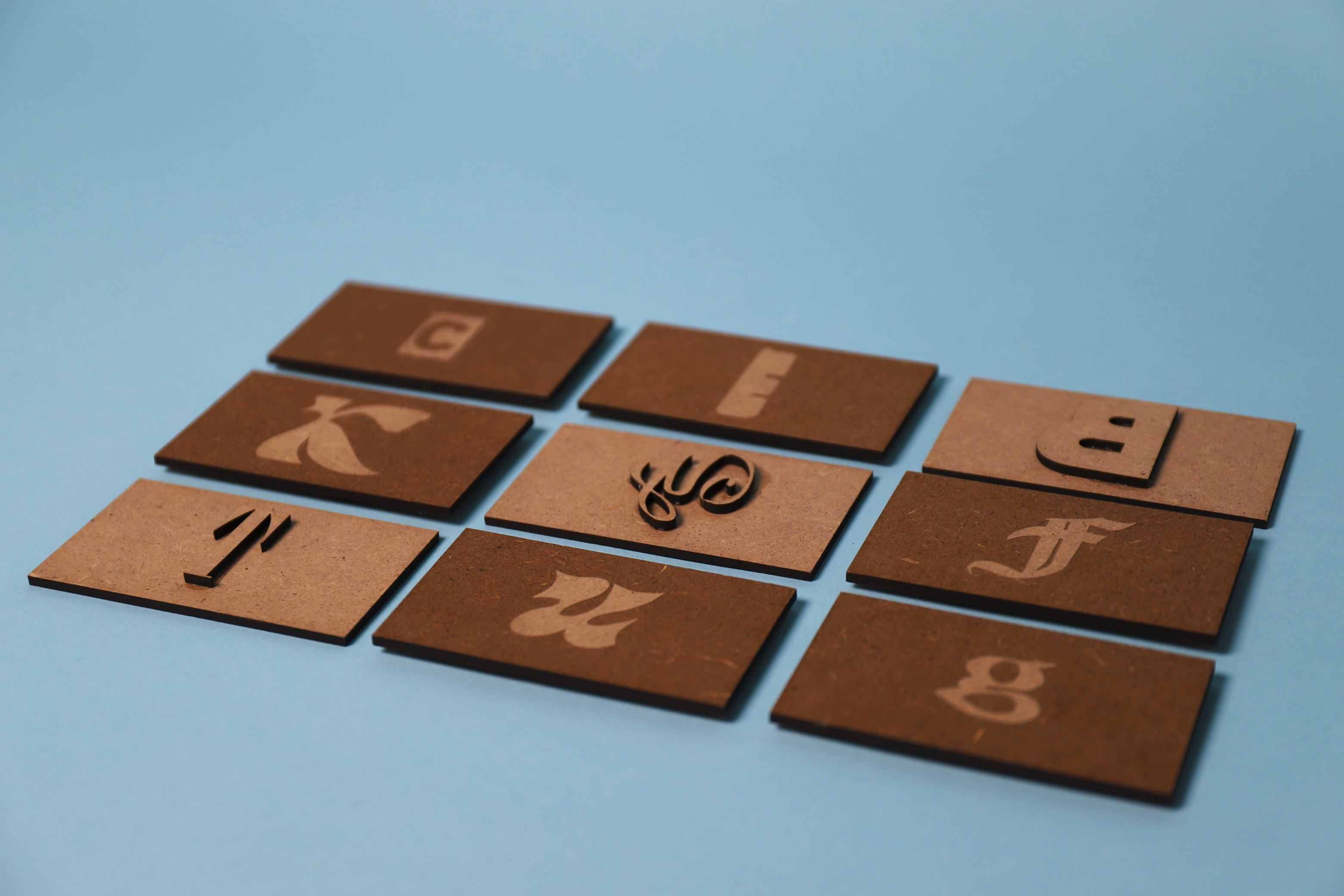
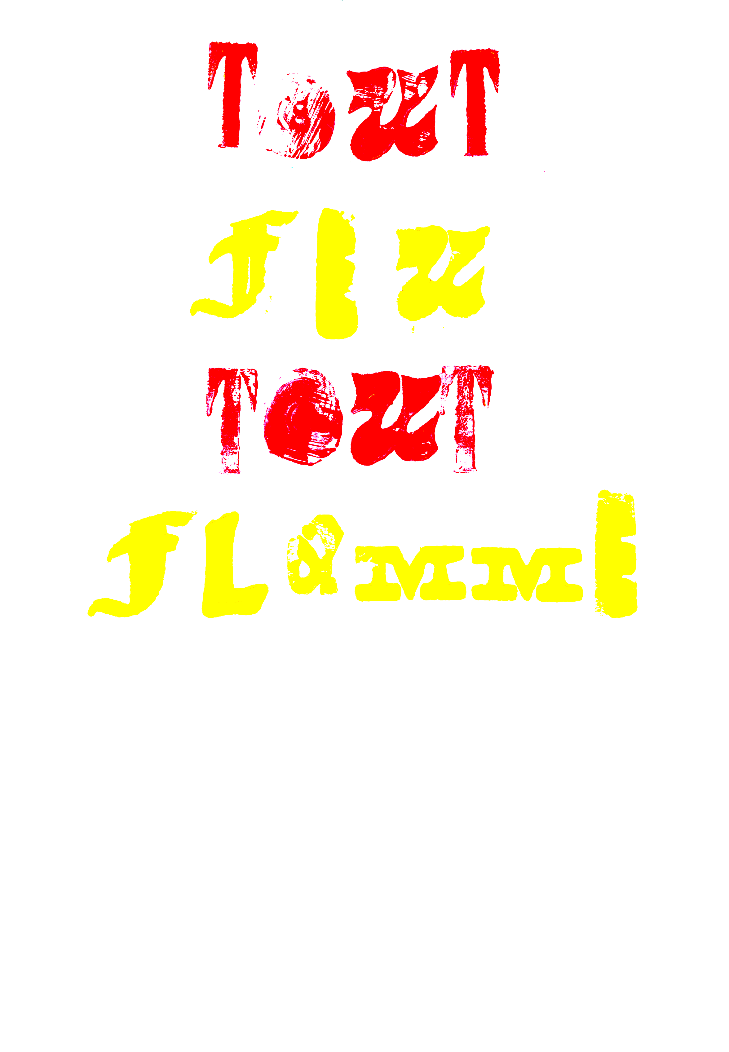
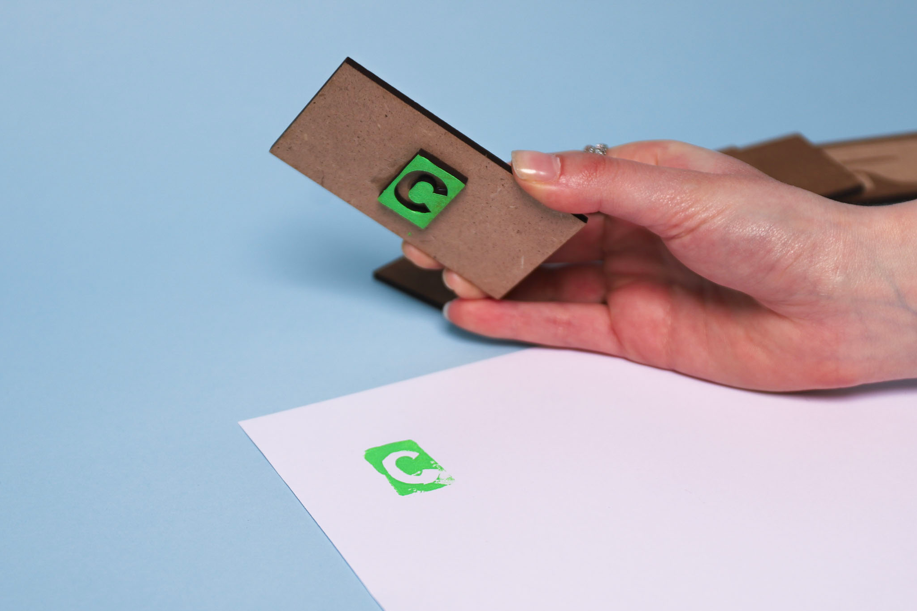
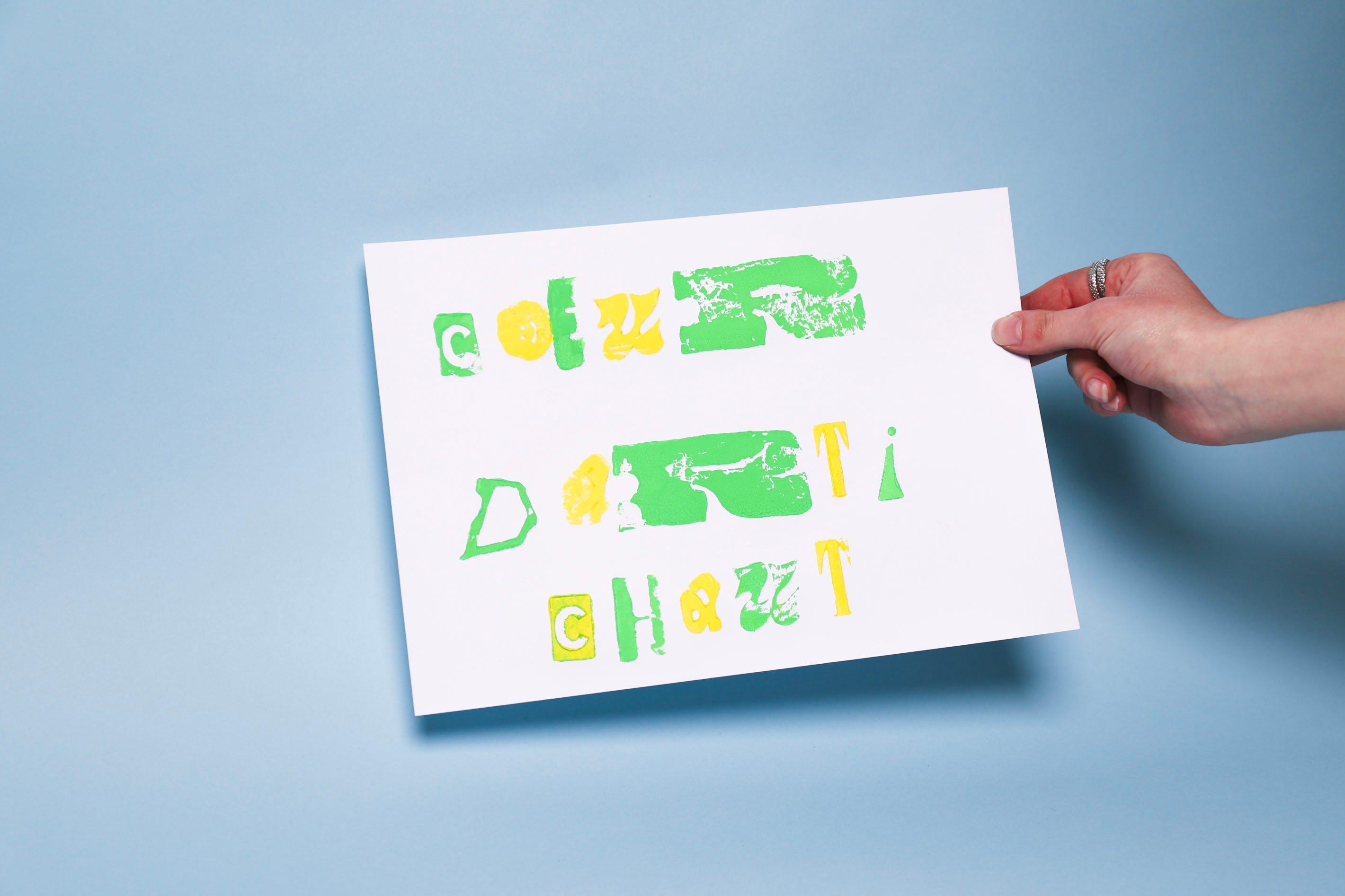
The Brigade
2024. Lettering stamps.
A personal experiment with typography, aiming to create a series of stamps that allow for the composition of posters. Made using a laser cutter, these stamps were designed to offer modularity and freedom in typographic arrangement. On my side, I created a series of typographic posters based on culinary expressions related to love. Each poster illustrates an expression, forming an experimental collection that evokes the world of a kitchen brigade, where words simmer, are cut, and assembled like the ingredients of a graphic recipe.

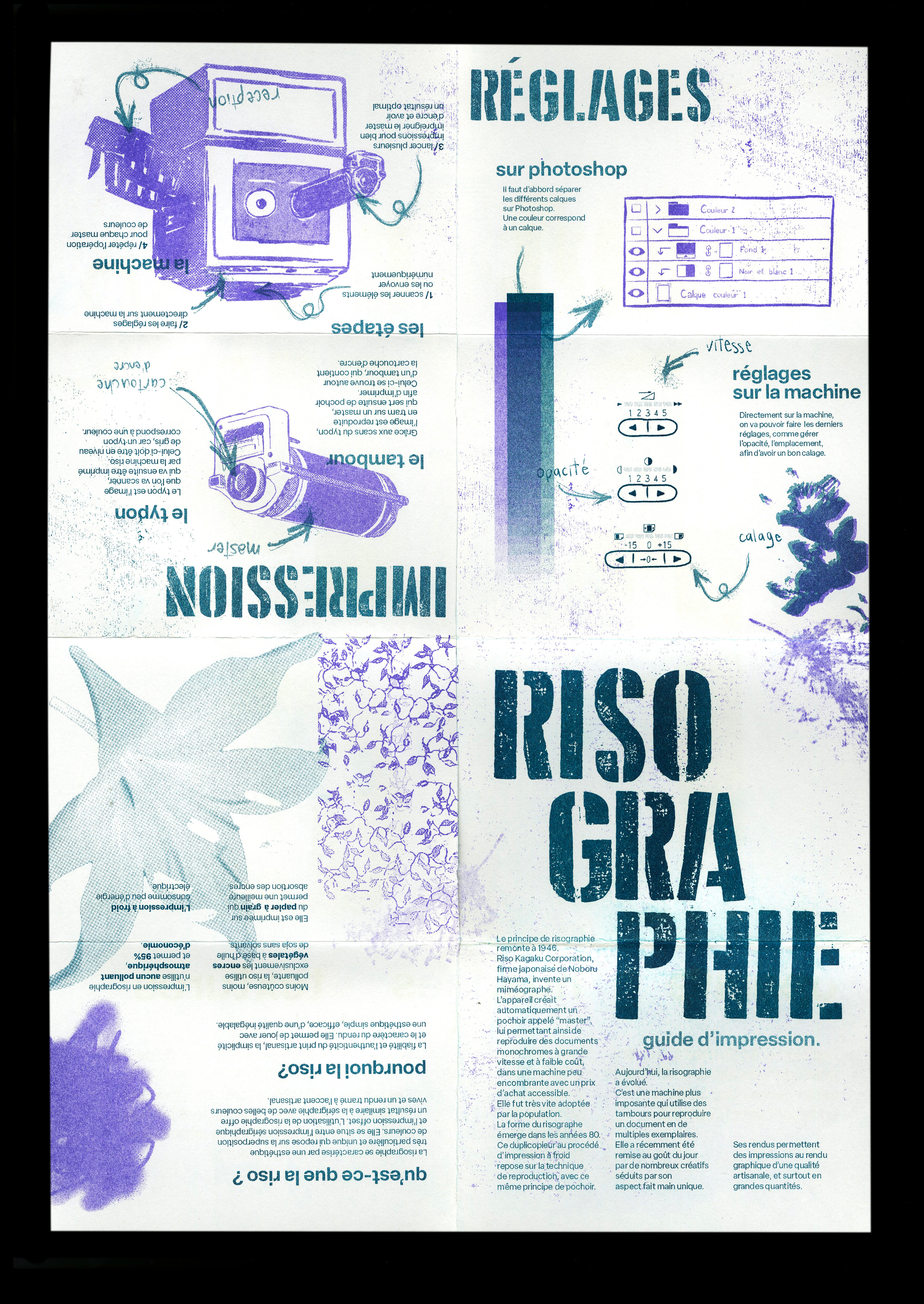
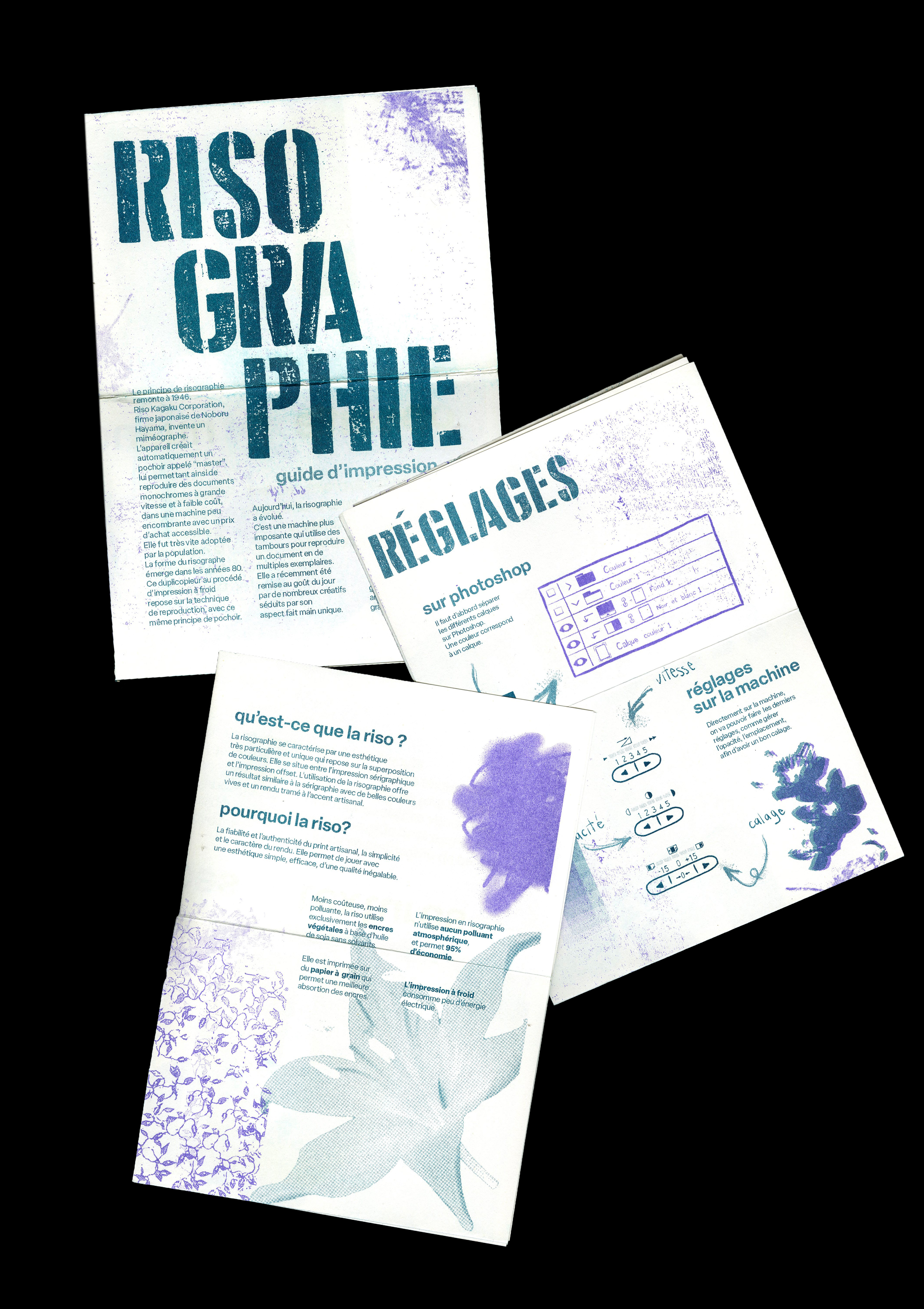
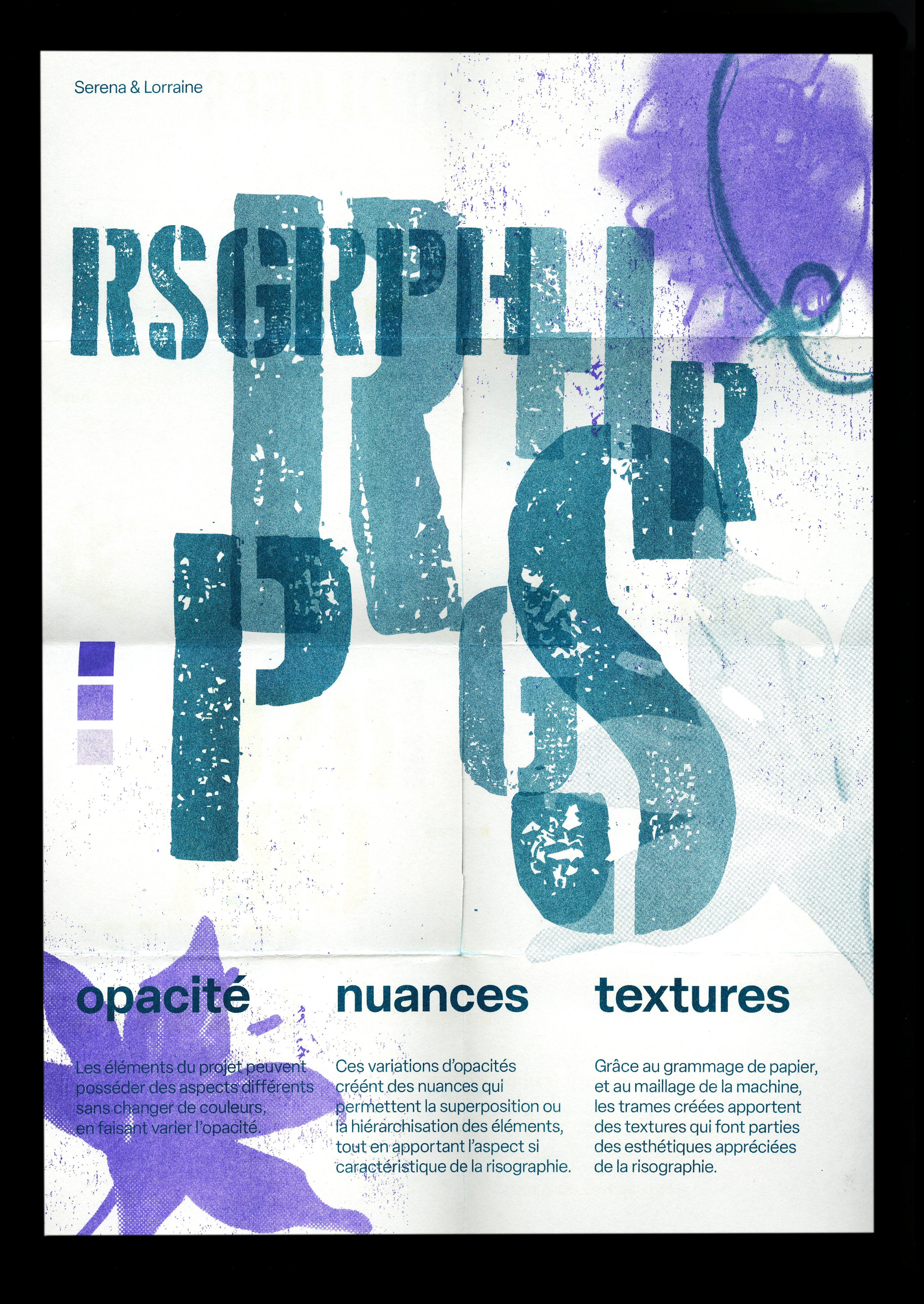
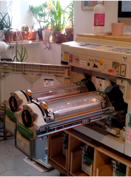
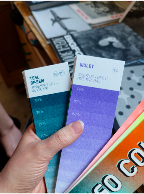
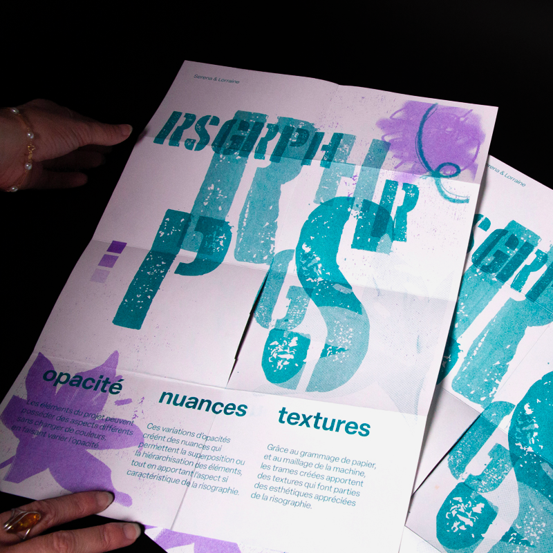
Riso, graphic
2023. Printing guide.
L'Atelier Quintal in Paris entrusted us with the creation of a fanzine explaining the history and process of risography. In collaboration with Serena Taleb, we designed this printing guide for beginners, incorporating a fold-out poster illustrating the specifics of this technique. Inspired by the style of Christopher Wool, we adopted an aesthetic combining stencil letters, floral patterns, and deliberate smudges. Printed in a two-color scheme of green and purple, in a limited run of 25 copies, this mini-edition was distributed to the workshop's clients and visitors, providing them with a visual resource to better understand and appreciate risography.
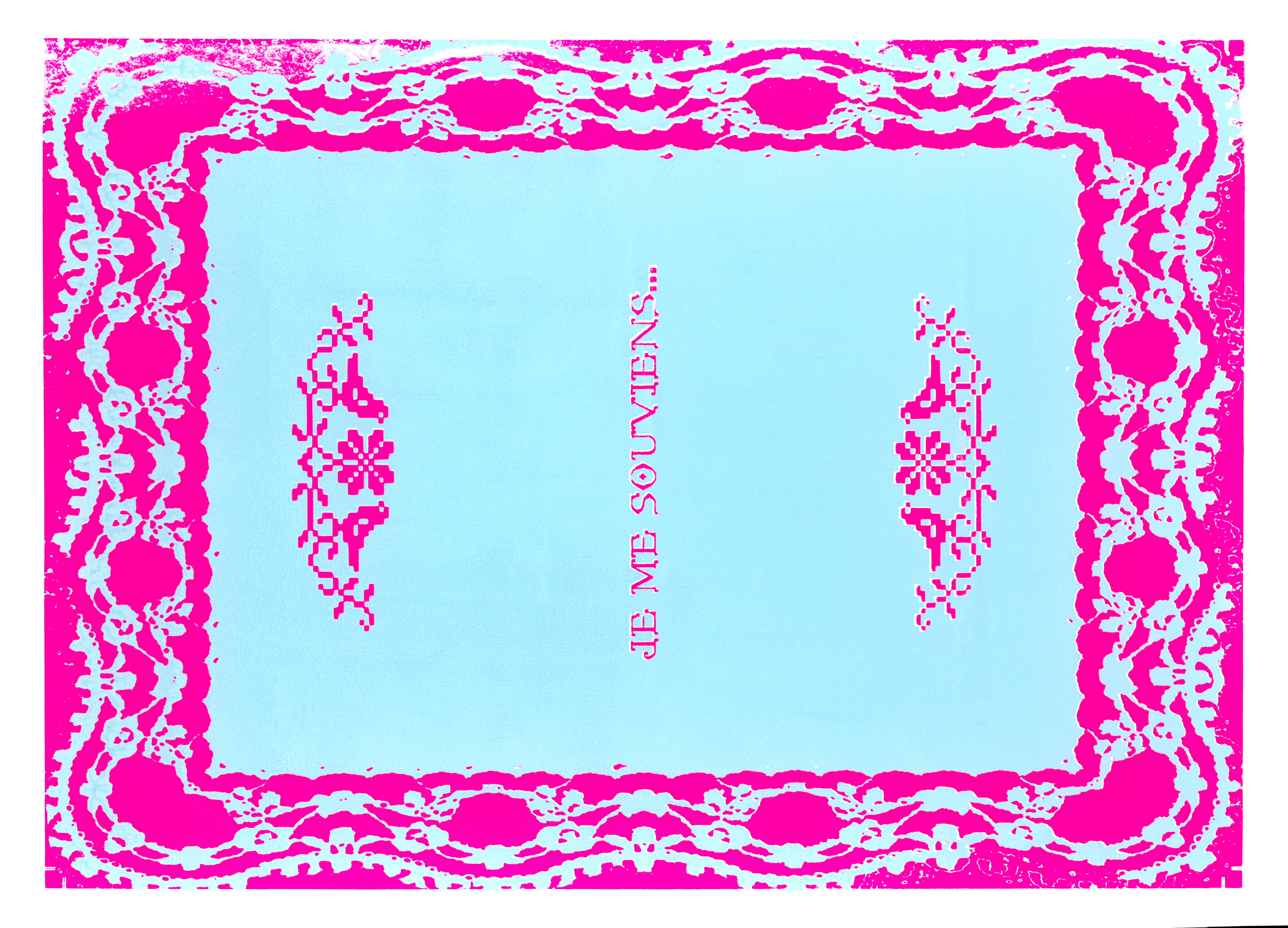
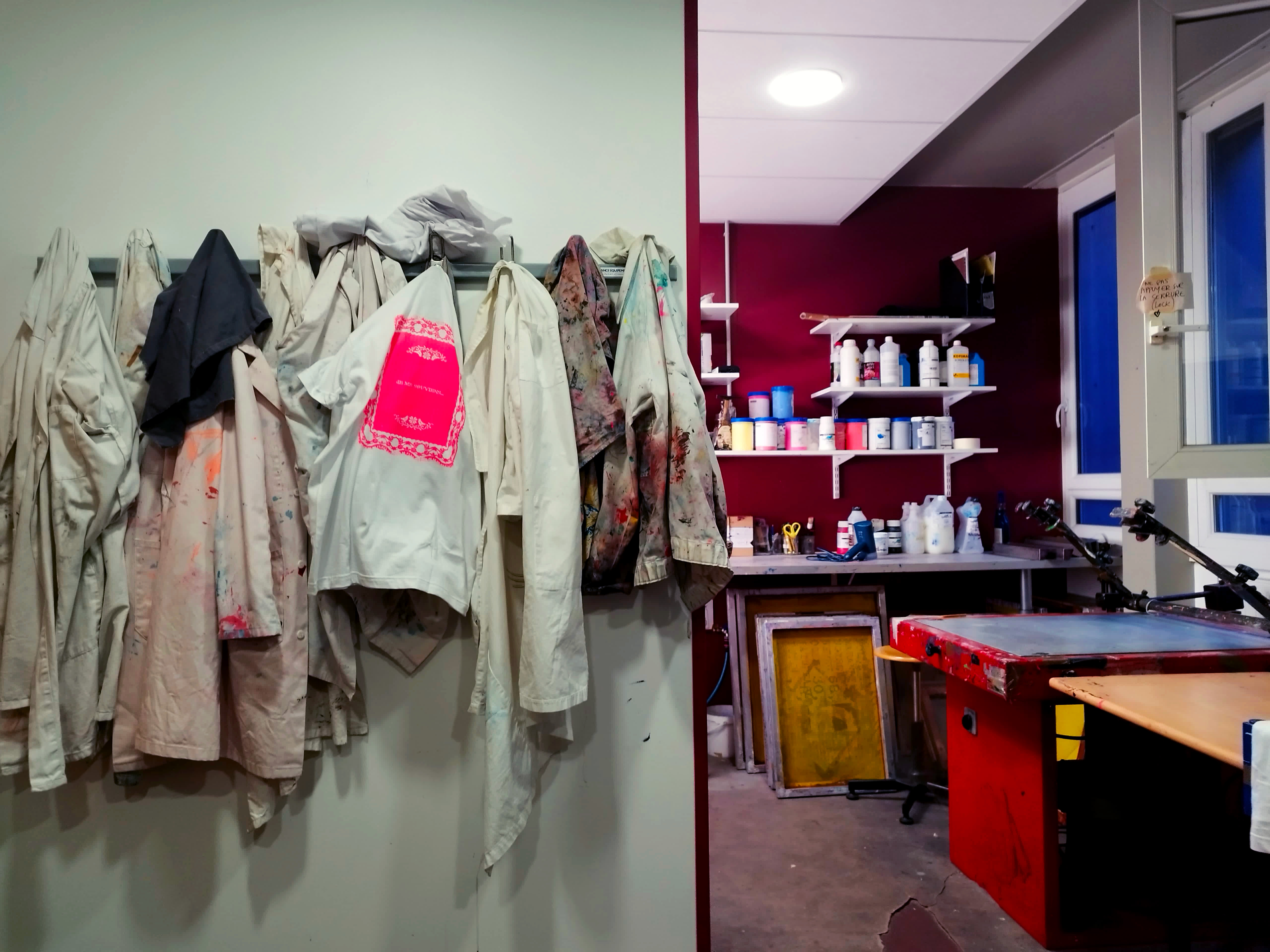
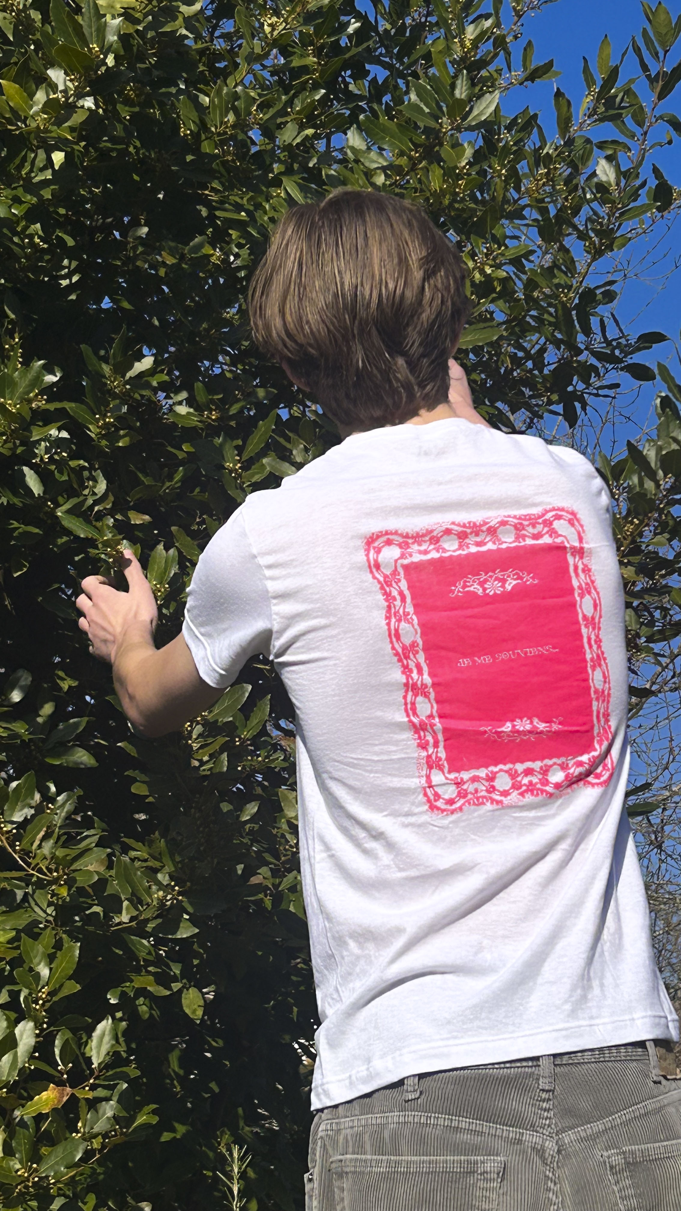
Lace Doily
2025. Screen printing.
As part of an introduction to screen printing, I designed an illustration representing forgetfulness and the passage of time, using a scanned doily and bitmap embroidery, symbolizing the transition between craft and digital techniques. Some details emphasize the idea of gradual erasure, illustrating how memory fades over time. I then adapted the posters onto t-shirts, experimenting with printing on fabric in addition to paper.
.jpg)